Designing the onboarding process for a mobile app
Dashboard redesign and onboarding design for a B2B mobile application - simplifying financial data interpretation and improving clarity of key indicators.
Overview
A mobile version of a B2B system used to monitor companies' financial standing - checking credibility, tracking changes, and downloading reports. Designed for businesses from small companies to larger enterprises.
Redesign of the main dashboard and creation of a contextual onboarding experience. The project started as an onboarding task - but an audit of the existing interface showed the UI itself needed to be simplified first.
Problem
Users had difficulty correctly interpreting the data presented by the main dashboard component. According to customer support feedback, four recurring issues were identified.
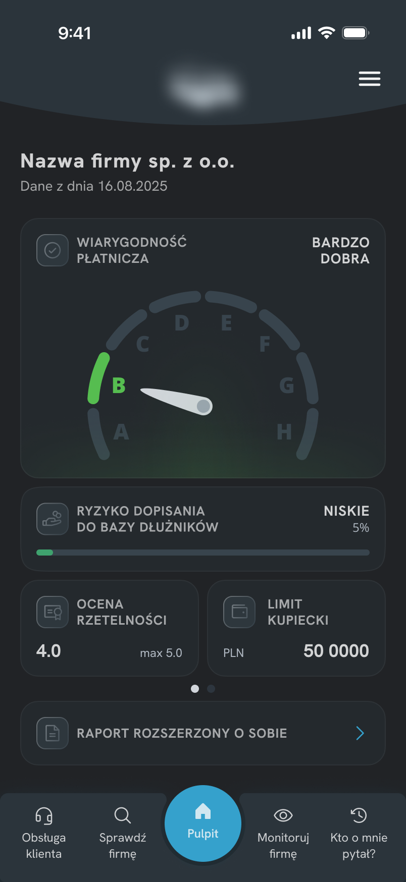
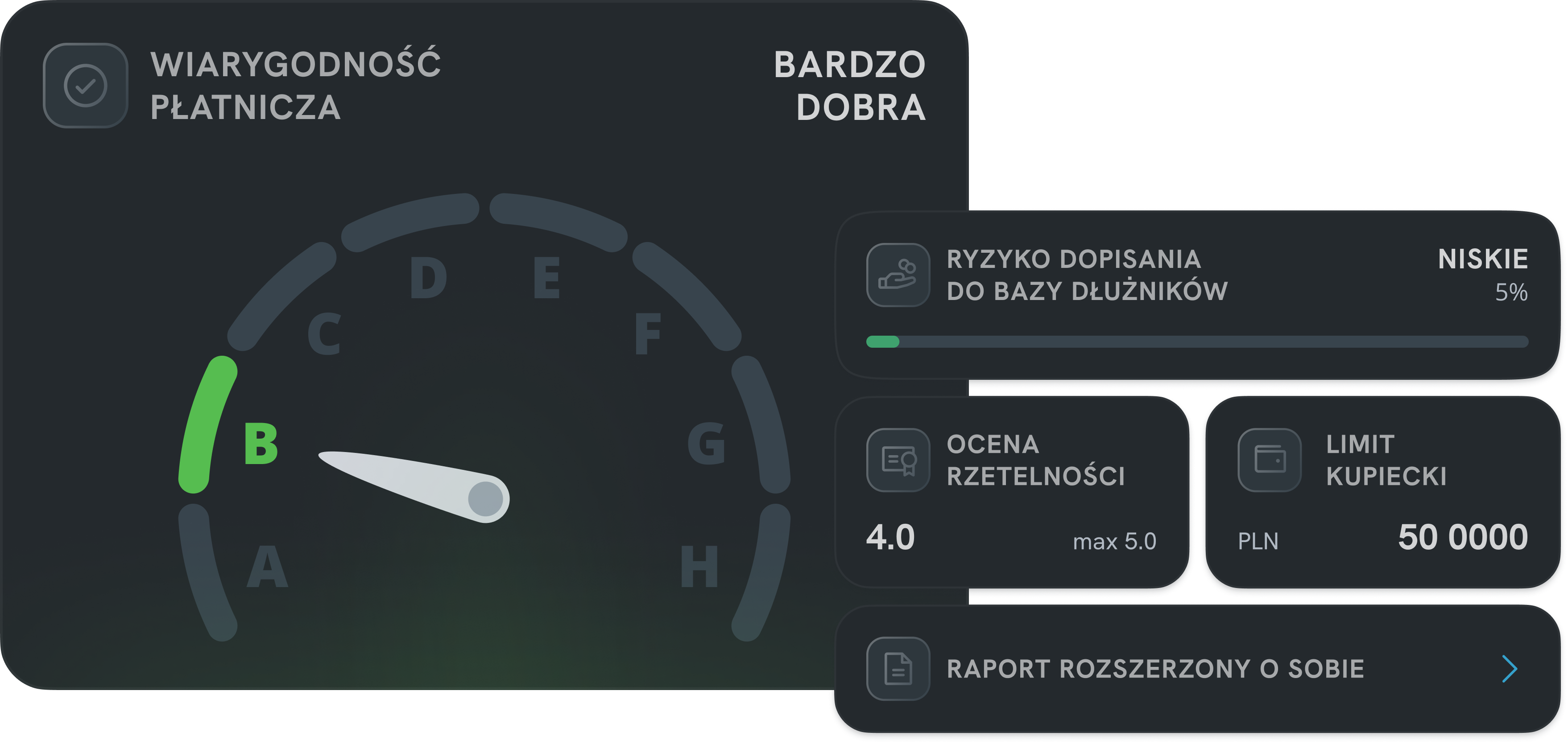
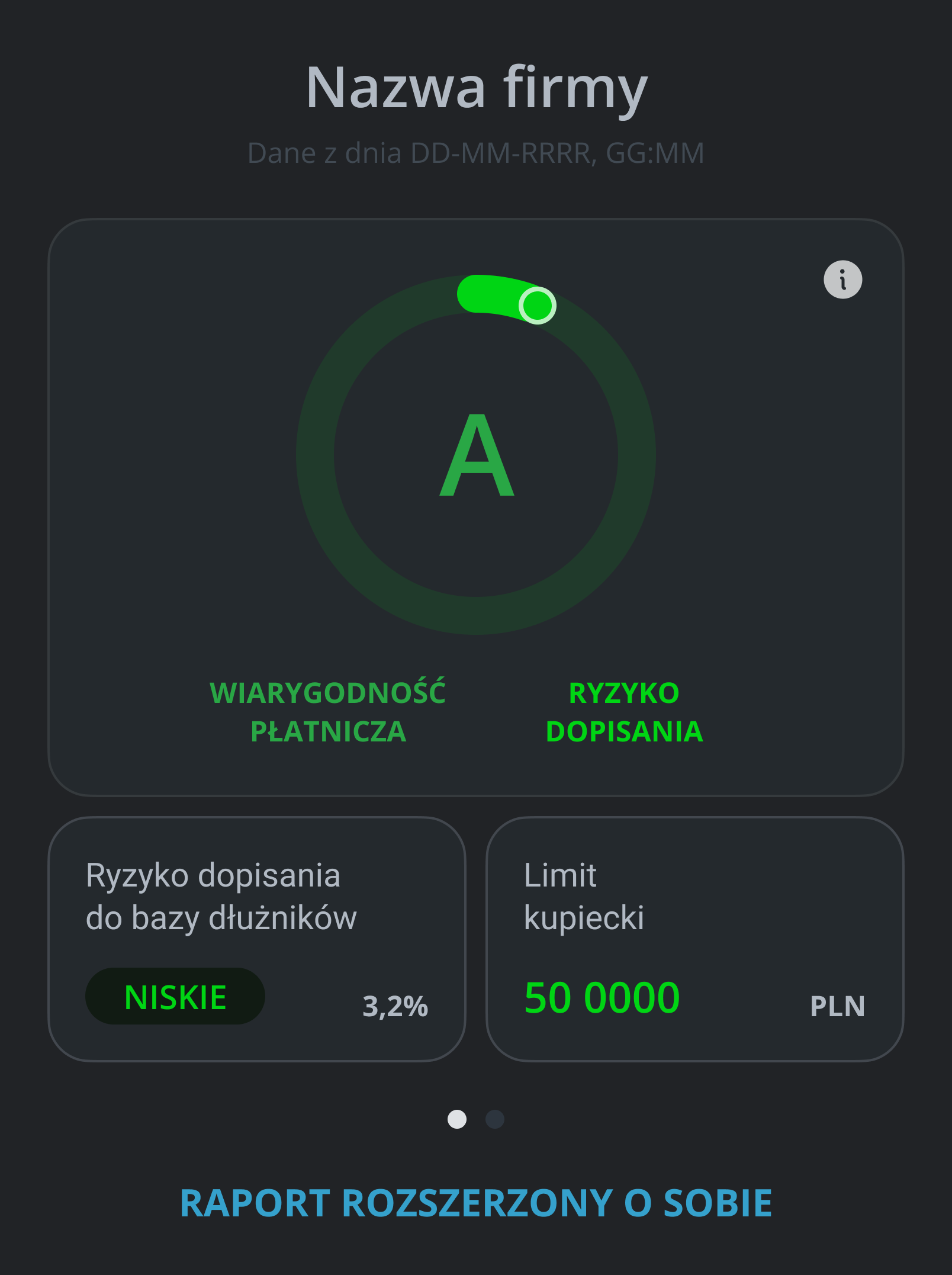
HOME SCREEN - BEFORE
ONE COMPONENT, TWO MEANINGS
Credibility and risk merged into a single visual element with no structural separation.
COLOR AS ONLY DIFFERENTIATOR
Meaning communicated through subtle color differences only - easy to miss.
INFORMATION DUPLICATION
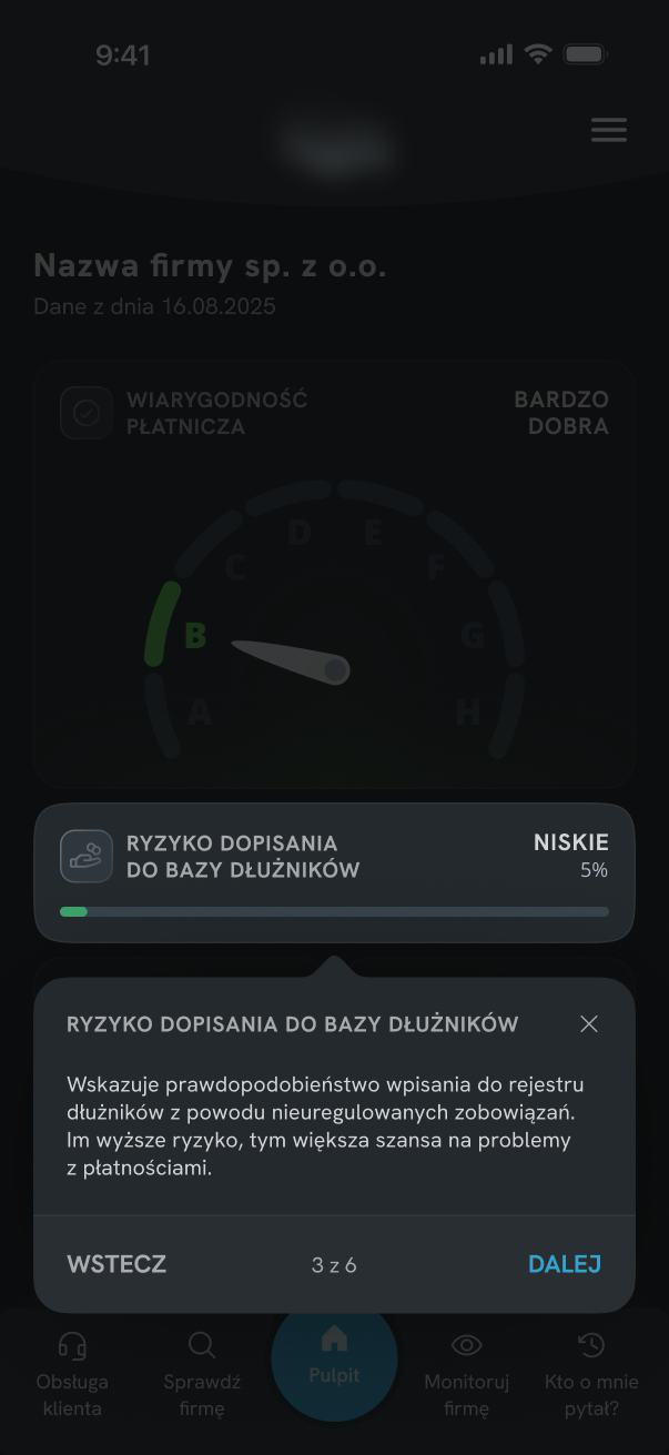
Risk data repeated across dashboard sections without adding new context.
LOW SCANNABILITY
Uniform visual weight made it impossible to identify what mattered most.
Impact
Customer support frequently received questions about dashboard metrics, suggesting that key financial indicators were not self-explanatory.
Goals
Separate financial indicators so users understand their meaning faster.
Simplify the structure, remove duplication, reduce visual noise.
Explain key elements without taking users out of the application flow.
Create a more modern and visually consistent experience.
UX / UI Decisions
Two unrelated metrics were merged into a single visualization, making it difficult to understand what was actually being measured.
Each indicator received its own component and a clearer hierarchy.
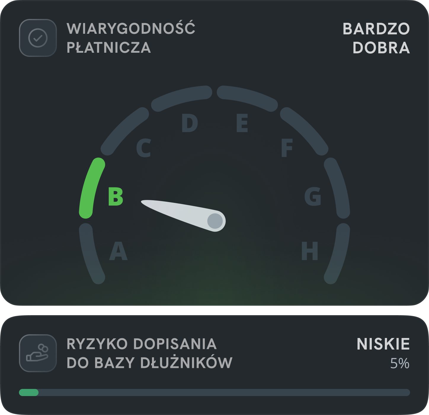
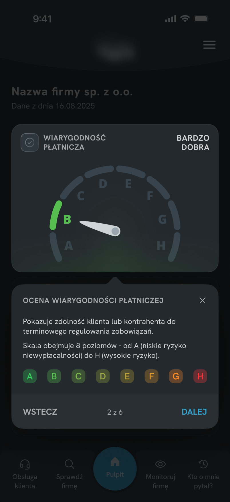
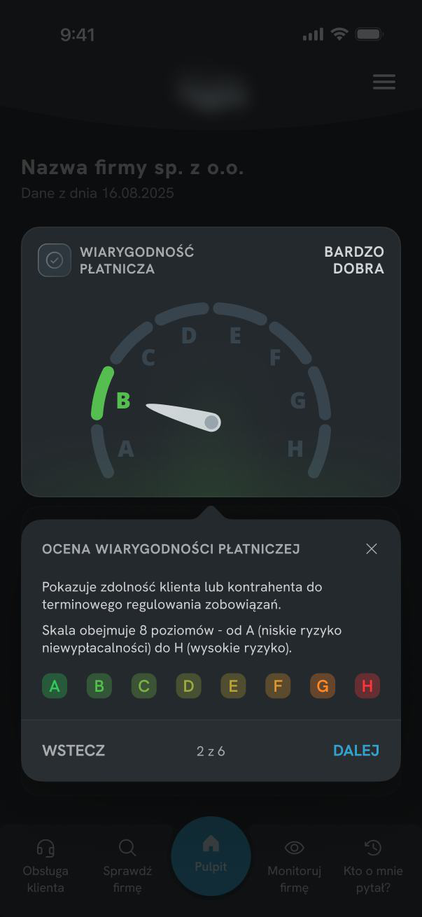
Instead of trying to improve the existing chart, I separated the information into two independent components - a shield gauge for payment credibility and a card for database risk - each with a single purpose and communicates it without relying solely on color.
- shield shape
- A-H scale
- verbal description
- clear position on the scale
- separate card
- progress bar
- clear 0—100 scale
The most important information became more explicit and easier to understand from the first interaction with the screen - without relying solely on color.
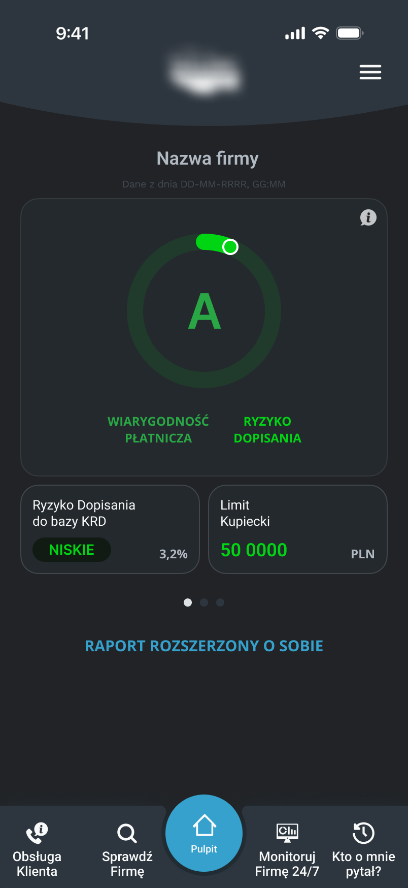
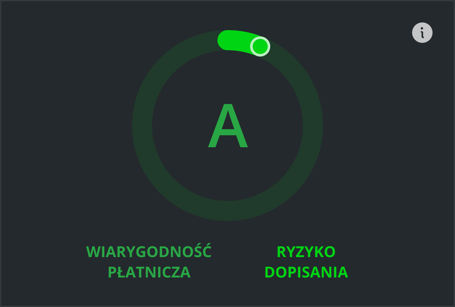
A scoring pattern users already knew from our other related products.
The same familiar model applied to payment credibility - no new learning required.


The new payment credibility indicator was based on a scoring pattern already used in other related products. Instead of introducing a new model for interpreting data, the redesign used a solution that was already familiar to users within the existing product ecosystem.
The dashboard became more consistent and easier to understand - zero additional learning cost for returning users.
Technical feel, difficult to scan, no clear visual hierarchy.
Modular layout, calmer hierarchy, more modern and scannable.
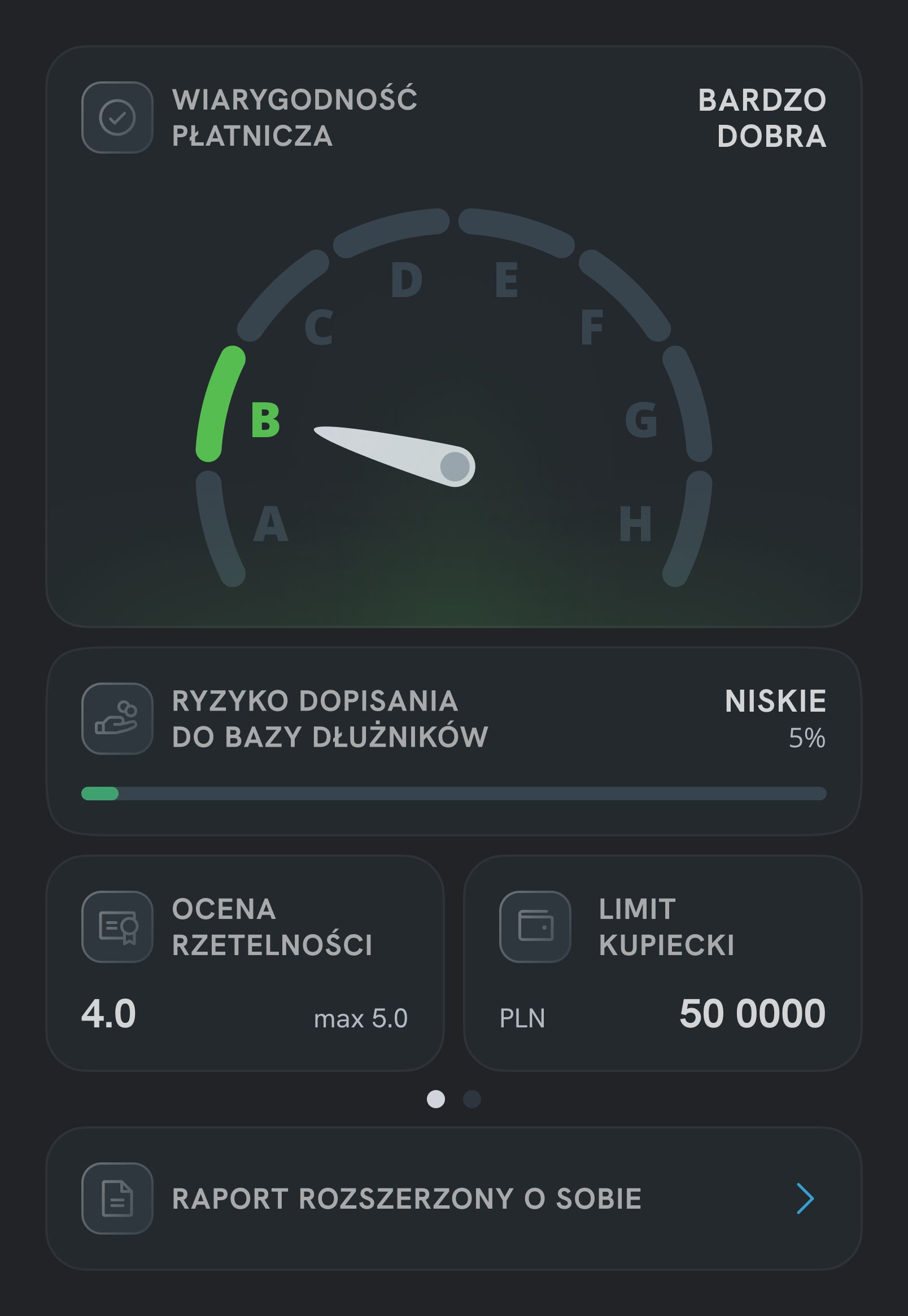
Larger spacing, a modular card-based layout, and a calmer hierarchy helped create an interface that was more scannable and less technical. The goal was to move away from the "official" character of the product and create a more modern experience.
This consistent pattern helps users quickly build a mental model across the entire screen.
Beyond Onboarding
The project originally started as an onboarding initiative. Customer support reported that users frequently asked about dashboard metrics and struggled to interpret key financial indicators.
During the audit, it became clear that part of the confusion came from the interface itself. Instead of explaining a complex dashboard through onboarding alone, I simplified the dashboard first and used onboarding only where additional context was still needed.
Users struggled to interpret dashboard metrics.
Create onboarding to explain the main screen.
Simplify the dashboard before adding guidance.
Onboarding
Three formats were considered. The choice came down to how closely each format matched the real interface context during learning.
The challenge was not explaining every feature, but helping users understand the parts of the dashboard that generated the most confusion.
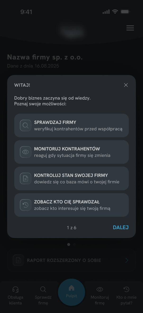
Separate onboarding flow shown before entering the product. Users learn the interface upfront, but without the context of actual use.
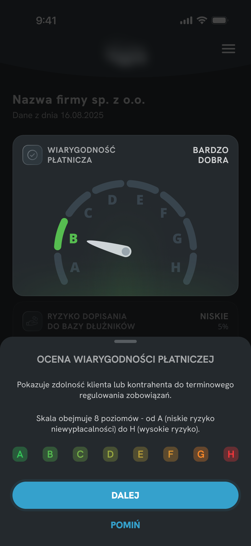
Sheet overlaid on the dashboard. It keeps users closer to the interface, but still explains the screen from a separate layer rather than pointing directly to each element.
 Chosen
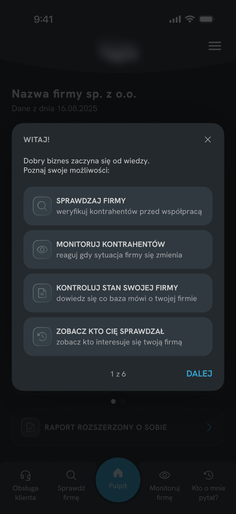
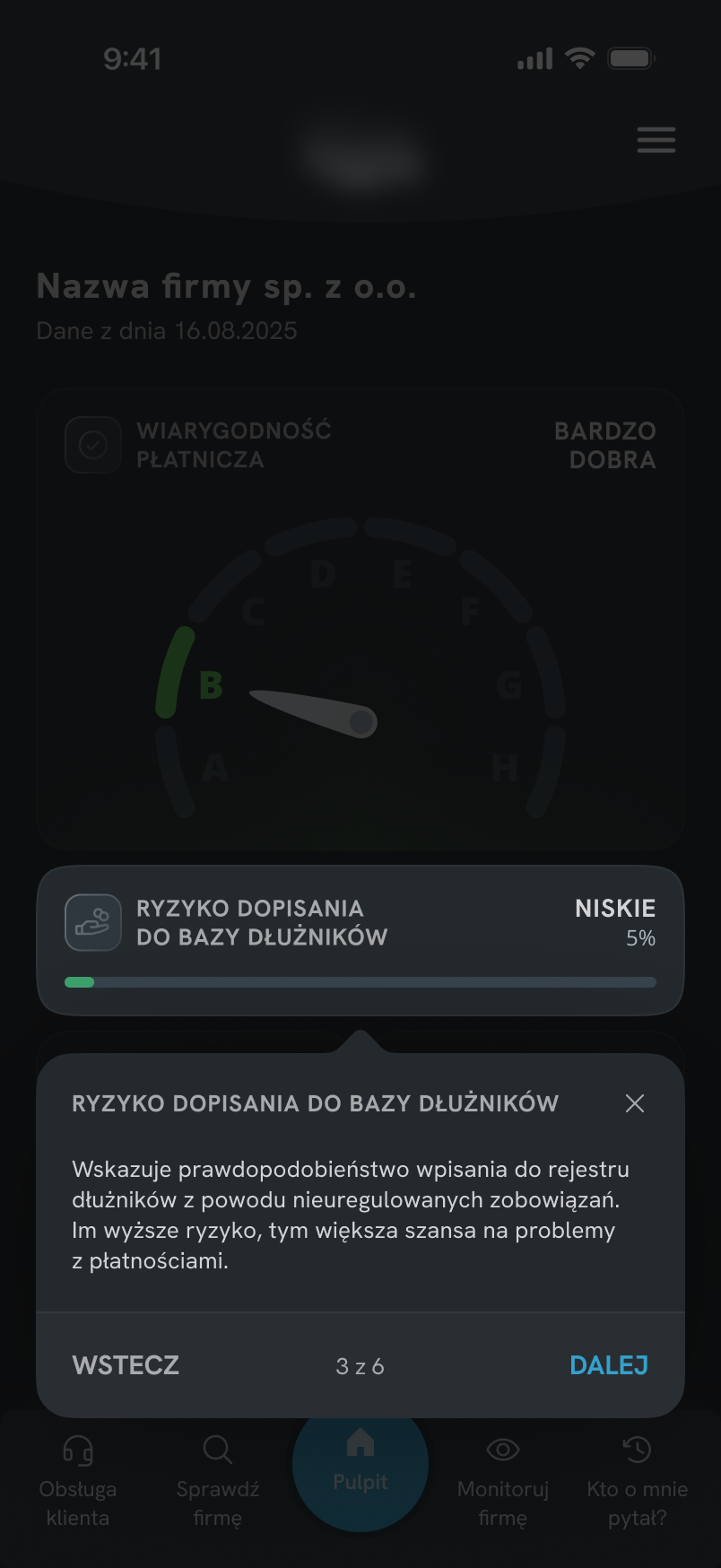
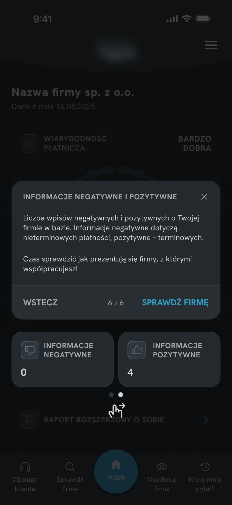
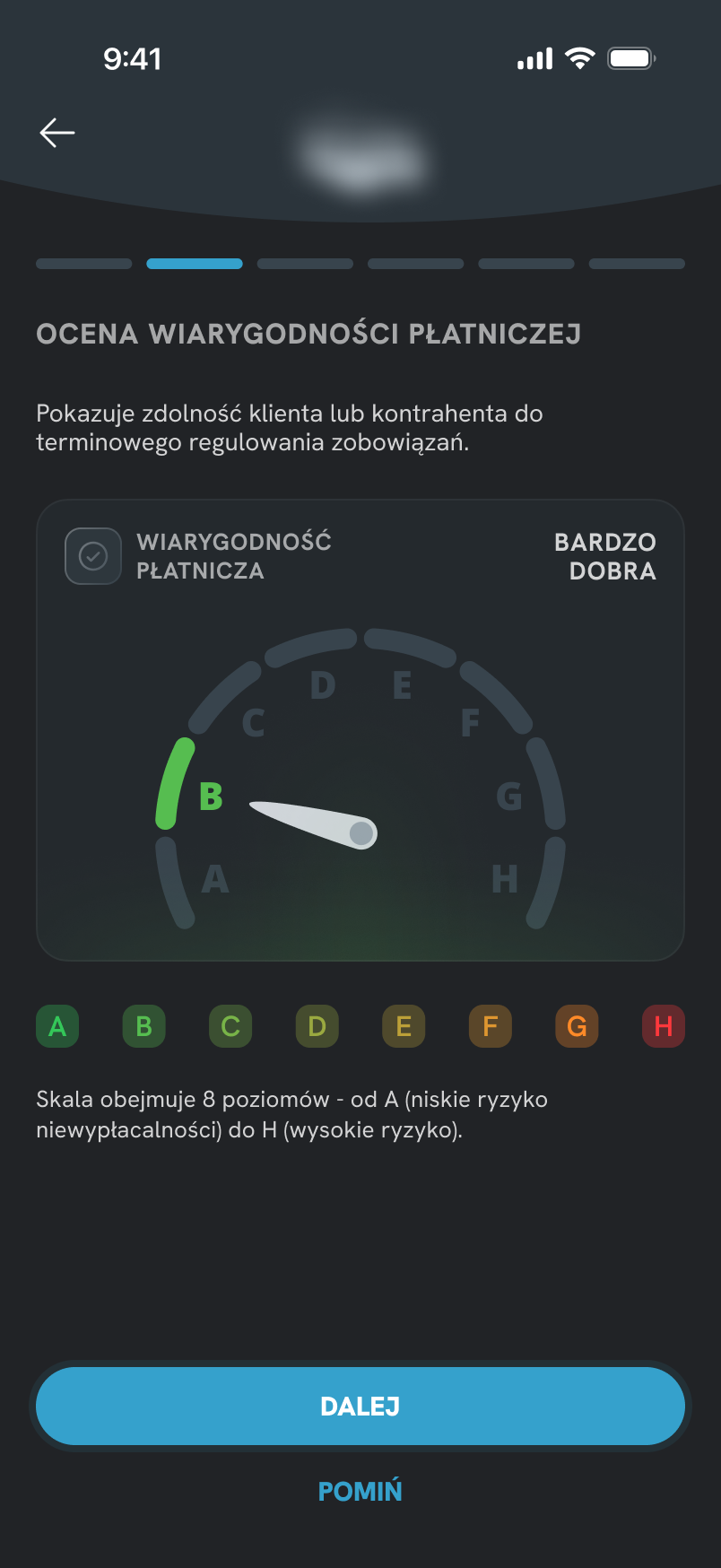
Contextual hints anchored to specific UI elements. Users learn directly within the interface, making each explanation easier to connect with what they see.
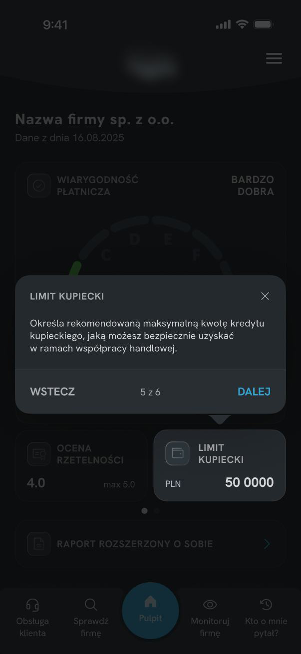
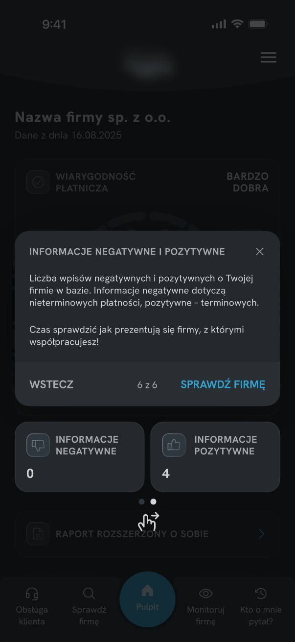
Coach Mark Structure
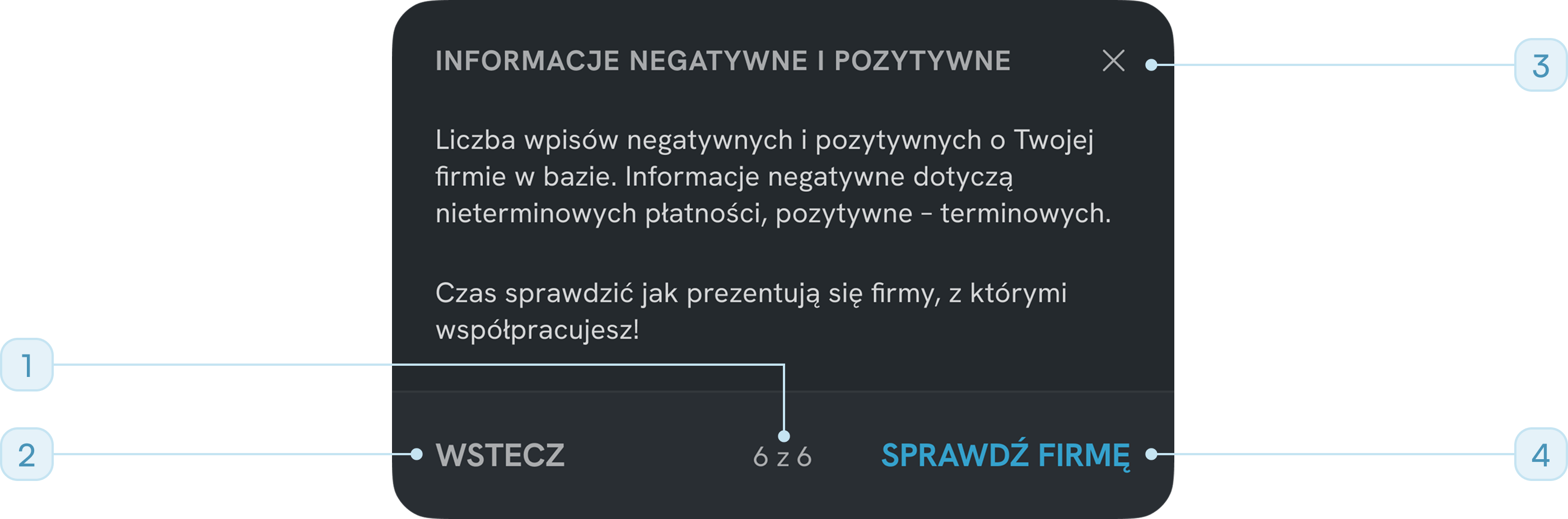
"6 of 6" - user always knows where they are in the sequence
"Back / Next" - user controls the pace, nothing is forced
Close (X) available at all times - not every user needs the full flow
"Check company" CTA - ends onboarding with a concrete next step
Final Solution
The redesign combined two complementary approaches:
- simplifying the dashboard structure,
- providing contextual guidance only where additional explanation was still needed.
This reduced the need for interpretation while keeping onboarding lightweight and focused.

Reflection & Learnings
This project reinforced how easily financial data becomes opaque when several meanings share a single visual container - and how small changes in hierarchy can significantly improve comprehension. In the next stage, I would like to validate whether users correctly interpret the new indicators during their first session.
- Onboarding is not a substitute for a clear UI. The brief was to build onboarding, but the dashboard needed to be simplified first. Onboarding should support the interface - not compensate for unclear structure.
- Context matters when users learn a complex interface. I chose coach marks because they explain each element exactly where it appears, helping users connect the explanation with the real dashboard instead of learning from a detached tutorial.
- Reusing a familiar pattern removes learning friction. Extending an existing scoring model from related products meant users could transfer their existing mental model immediately, without new learning cost.
- Separation is often the simplest solution to ambiguity. When one component carries two meanings, splitting it into two usually costs less in screen space than it saves in comprehension.